Building Design App For Kids
With the boom of digital, education can't be left behind.
Although perceived by many as a threat to traditional education, web and mobile apps can play a big role in children's cognitive development. From a design perspective, there's still a lot to be done. So how can we, designers, help our users (kids) making the most of their experience when interacting with a digital product?
That's exactly what I'll cover through this article. I'll share with you some of the challenges when building a mobile app for kids, like seeing the world through their eyes, understanding their gestures or how to get them engaged by using color and text. I'll also approach what UI/UX designers should consider when building reading apps for children, being those educational web or mobile apps.
Why are apps important for kids ?
I believe that apps in general can be a great complement to formal education.
However, these web or mobile apps need to keep up with today's youngest generation needs. Kids grow up immersed in the digital world like never seen before. This is a huge opportunity to create valuable products that can be integrated with the current educational tools. Not only they estimulate kids learning process, but also to help tutors and teachers to better manage assigments.
Readings apps for kids matter
According to the Reading Agency, in 2014 one in five children in England could not read well by the age of 11. This number is followed by PISA results from 2018, which shows several countries' reading results falling behind. The latter results are not to be seen as a ranking, but rather as educational improvements to be made. Children of different age groups might face different challenges regarding reading (besides pre-existing reading disabilities), and the earlier educators and parents can help to tackle them the better.
Being known that kids struggle to read and practice reading, these apps can be of great help, not only for schools or educators, but especially to help kids improve reading skills.
Best practices to design apps for kids
From a design perspective, it is exciting to look into how this a target group can benefit from interacting with apps.
Designing for such a playful and demanding audience can, however, be challenging if you don't have a set of principles in mind as I'm explaining below.
Kid's age group defines the design
Kids are constantly changing and so are their capabilities, needs and goals. If there's one thing to recall is that cognitive and physical skills can differ drastically from one age to another.
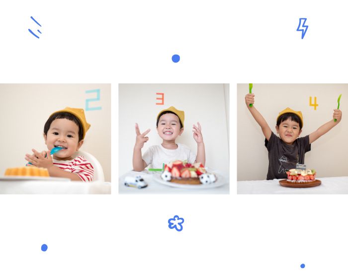
In that sense, adapting the app you're designing to each skills' age group is a good strategy.
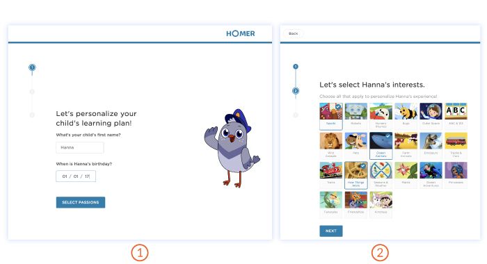
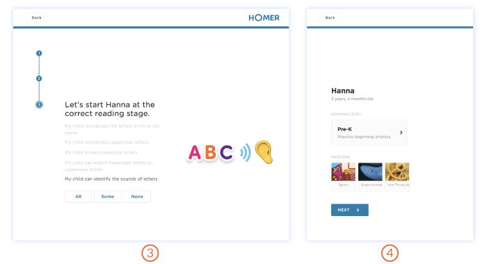
Take the example of Homer app a personalised reading app, where the onboarding guides parent(s) through a journey of selecting the kid's age (to find their reading level). It takes into consideration skills such as matching lowercase with uppercase, sound recognition, rhyming, consonant/vowel reading, spelling, etc. Allowing parents to answer about such capabilities gives the user (the kid) a customised experience designed for that specific age, behaviour and interests.
Children's interests, engagement and willingness vastly vary from a toddler, to a preschooler and a grade-schooler. Keeping these aspects in mind might prevent you from getting that comment from a 10-12 year old saying "This is too silly!", or even "I don't use these baby-like things anymore!".
Age is the first and decisive aspect that will be crossing all the aspects and decisions throughout your design process.
Tiny hands, big gestures
Besides the reading skills difference, there's also a gap regarding the physical abilities. That is essential to bear in mind while designing an app for this target group. According to a study made about children's interaction with tablet apps, children's skill level can be separated into 3 main age groups regarding hand gestures. The major differences are found in toddlers (2 and 3 years old), whose fine dexterity is not so developed yet. From the age of 4 and onwards (until 12) the main hand gestures when interacting with an app become more standardised.
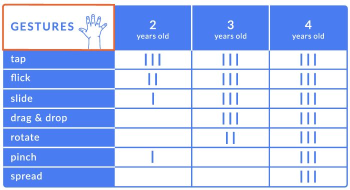
Overall, always try to understand how your younger audience interacts with touch interfaces, based on their ages, and so, gestures. Take the case of toddlers (see previous table):
Focus on broader gestures, like swiping and grabbing and tapping, rather than pinching, rotating, dragging & dropping, etc.
Design for the use of full hand gestures, since it's not so common that kids at this age use thumb and index gestures only.
Kid's readability is crucial
Besides having in consideration the age group, it's important to provide visual cues that can guide the user. Also, bear in mind to adapt the content, make the app accessible and allow personalisation to create a valuable experience. Since the user in question can differ in background, behaviour and skills so much, being able to adapt its features helps parents or educators to choose what better suits their kids.
However, there are some guidelines you should follow:
- Sans-serif fonts - considered more easily readable when compared to Serif ones;
- 16px for body text and subtitles - bigger fonts are perceived more clearly than 14px or 12px;
- White font colour - best solution for multi coloured backgrounds;
- Portrait mode - for more heavy texts, it works best, since it has a more balanced line length than landscape mode;
- Animation - it is not a must-have, however animated visual cues help children engage with reading.
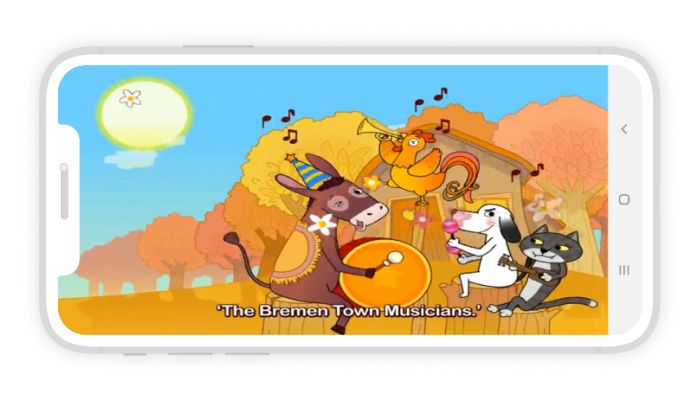
When designing reading apps these might have different aims: phonics apps, guided reading apps, reading game apps, etc.. Before children learn to read, they might start with phonics/game apps), since they cannot read yet. You should pay special attention when designing for these early readers. In that sense, visual elements need to be thought through with more attention and given more emphasis.
See the world through a kid's eyes
While adults tend to see the world through their experiences and opinions, kids are still discovering it. That is one of the main differences when designing for kids.
A big part of being a kid is actually to discover, to face the challenges a game, app or any other experience might bring along. In other words, kids are used to learning things constantly.
In that sense, what for an adult might be a frustrating experience because we don't see the ultimate point of going through such journey, kids are used to exploring, wandering and discovering things.

Besides that, kids have an easiness to enter their own world and transform what could be an everyday object into a castle, airplane, monster, you name it.
As a designer, taking inspiration from real-world experiences is extremely rewarding when developing a digital experience. So, trying to understand how kids are learning through real-life experiences about the first letters of the alphabet or practicing their reading skills, it's a great clue.
Taking inspiration from offline elements or even combine them with the digital experience is a way to create metaphors that will help kids stay engaged. For example, incentivising kids to learn how to write with a pen and paper is an important exercise for their dexterity, instead of only presenting on-screen exercises.
In a more literal way, seeing the world through a kid's eyes also means understanding how they perceive displayed information on screens.
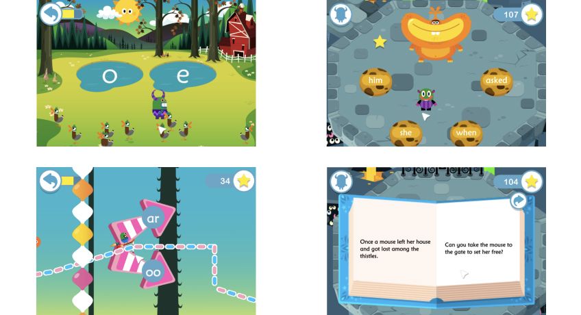
One more important detail: children should not be overloaded with information (well, same goes for adults, but big emphasis for children in particular). So try to keep only one main element per screen, together with one main action only. The same applies to the colour palette used and the number of elements. There's the misconception that kids' content should be full of joy and playfulness. However, that often translates into overly done interfaces, that are hard to interpret. So, do use colour, but efficiently! Use fewer yet bright colours. This applies especially to younger kids (2-4 years old) since the older they get, the more complexity they can handle. But again, do not overload your user.
Ready, set, test!
As soon as there's a concept or prototype you can test, then it's time for it. Designing for kids involves even more testing throughout the design process. While with adults there is, to some extent, a better understanding of how that product will be perceived, with kids there's more room for imagination and unpredictability.
Practically speaking, plan your testing session carefully. Have in mind the kids' day schedule: for example, if you plan it for later on during the day you might get a tired and slightly grumpy user after an energetic day at school. Another thing to have into consideration is the plan for the meeting, who will be present and what is each person's role. Are you testing a group of 2-3 children at once? Are you doing the testing with one kid at a time? Have in mind the kind of experience you're designing and what you need to get from the testing session. Sometimes parents/educators might intervene too much (or too little), so set your goals beforehand with them.
Above all, it's important to be in an environment where kids feel free to learn and play, without it affecting them. This also means not giving too many instructions or questions on how to behave, otherwise you might get biased outcomes.
During this time observe how the user interacts with your product. Both regarding its concept but also later on, regarding the interactive gestures they do to complete a task or the way they navigate. Don't forget that observing the design's readability is essential during these moments. Keep iterating and testing with your users.
Kids are your users, parents are your customers
When designing for kids, the whole journey starts with parents/educators. They are the ones that will make the decision of downloading your app and possibly allowing their kids to use it. Passing through that approval is the first big test.
In that sense, the onboarding and the designed parents' features should be as clear and trustworthy as possible. Create a visually different parents' mode that is easily recognised, helping them understand that those features are not available for kids. Among these features, parents should be able to set rules, permissions and decisions. Perhaps the app should turn off after a set time? Allow for any social media, location or gallery access? Let the volume be mute at all times? There should be some adjustable features for a better experience, however, keep it simple and concise.
Once the app has made its way through parents' approval, the decisions taken during the onboarding should be saved. This way, parents know they can pass the device to their kid without having to worry about further notifications or permissions.
Design apps for children and parents' best interest
As designers, we have the responsibility to create apps that let kids grow healthy. In essence, developing products to promote behaviours where kids are learning, growing and thriving with. Especially when it comes to reading. Incentivize for alphabetization is giving kids the tools that will allow them to become better communicators, thinkers and critics. Of course parents and educators have an important role in this matter, since apps do not stand alone in the whole ecosystem. They have to be promoted (or not) during the right times, to give children the support they need to grow.
Don't forget the regulations along the way
In the end, don't neglect the importance of children's safety online. When designing for children there are certain privacy and protection matters to be aware of. COPPA (Children's Online Privacy Protection Act) , and CGDPR (General Data Protection Regulation) give guidelines for children online security that shouldn't be forgotten.
Very recently, Google released an educational app verification, which gives a teacher-approved badge to good educational apps for kids in the Play Store. It is a good way to help parents skim through the amalgam of apps for educational purposes. However, Google hasn't revealed the parameters of its evaluation. Doing so would make it even more transparent for parents, educators, and everyone working in the industry. The market should indeed make an effort to keep regulation in place, meaning children's rights are being followed. Nonetheless, it is a discussion to maintain, where governments should be more involved, not leaving the decisions solely to the industry.
Kids, apps & the designer's responsibility
Nowadays we can find tons of educational apps for kids and, in particular, reading apps. However, the question remains: are they good enough to help children? There are certainly still many poorly designed apps and that's why, as designers, we have the responsibility to create better experiences for kids.
In essence, we need to keep researching and testing our products and prototypes, so that we keep learning how to improve interfaces, readability, content, how kids interact with apps, etc. Hopefully then designers have truly done their share in promoting children's reading skills, and thereby promoting the right tools for them.
To me, improving people's lives should be one of the main goals of a designer. In this case, it becomes even more essential since we're talking about building apps for kids. The need for accessible remote education has recently been proven vital and will continue to grow in importance, with great underlying challenges to come with it.

Found this article useful? You might like these ones too!
- Why a UX designer is essential for your next web or mobile app
- We need to calm our technology down
- A typography workshop
At Imaginary Cloud, we simplify complex systems, delivering interfaces that users love. If you've enjoyed this article, you will certainly enjoy our newsletter, which may be subscribed below. Take this chance to also check our latest work and, if there is any project that you think we can help with, feel free to reach us. We look forward to hearing from you!
Twitter Facebook Linkedin
Building Design App For Kids
Source: https://www.imaginarycloud.com/blog/designing-apps-for-kids-a-reading-app-user-experience/
Posted by: goodwinengifiricent.blogspot.com

0 Response to "Building Design App For Kids"
Post a Comment